


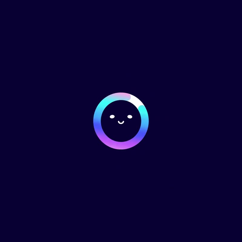




그라데이션 스타일 로고
Gradient logos blend instead of choose: hues flowing into each other inside one mark — tech's favorite way to feel alive without illustration.
47개 사례 · 엄선
What is a Gradient logo?
The gradient is tech branding's reformed villain — banned by flat-design orthodoxy, resurrected by Instagram and the AI era as the look of living color. This wall's marks pair the effect with abstract and techy geometry: gradients that suggest light, energy and computational glow. The craft is control — one hue family flowing within the mark's own structure — because a gradient across unrelated hues reads as wallpaper, not identity.
Types of Gradient logos in this collection
- Analogous gradient logos — one hue family flowing between shades, the controlled register
- Vibrant gradient logos — multi-hue flows for AI-era energy
- Subtle gradient logos — near-invisible tone shifts adding depth without noise
How to design a Gradient logo
Treat the gradient as one color decision, not two: hues must be neighbors in feeling, flowing along the mark's own structure. Design the single-color fallback first — if the mark needs the gradient to work, the underlying form is not strong enough yet.
그라데이션 logo FAQ
Are gradients good for logos?
With control, yes: the modern gradient — one hue family, structured flow — adds life that flat color cannot. The trap is using gradient as makeup; the wall's marks use it as lighting.
Why did tech brands bring gradients back?
The flat-minimal decade made everything look the same, and gradient was the sanctioned way to feel alive again — Instagram normalized it, then the AI era made glow the look of intelligence.
Do gradients reproduce well?
Worse than flat color: gradients band in print, blur at small sizes and demand careful contrast management. Every serious gradient identity carries a flat fallback — design it first.
Where can I find gradient logo inspiration?
This page gathers real gradient logos, each credited to its designer. For the full library, browse our logo inspiration gallery.
더 많은 스타일 카테고리
여기의 각 그라데이션 로고는 더 큰 스타일 언어 안에 속합니다. 이 인접 스타일 카테고리들은 손길은 달라도 이 벽과 같은 직관을 공유합니다.
그라데이션 로고 카테고리별 탐색
이 벽만 보면 부족합니다. 그라데이션 로고는 혼자 다니는 법이 드물고, 대부분 모던, 테크, 테키 같은 특징도 함께 지닙니다. 태그를 따라가 교집합을 직접 확인해 보세요.