


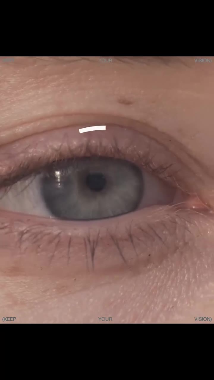


아이 형태 로고
Eye logos put perception itself in the mark: vision, awareness and watchfulness — the one symbol that looks back.
11개 사례 · 엄선
What is a Eye logo?
The eye is the rare symbol that engages its viewer directly — it reads as being seen, which is why attention, vision and security brands claim it. This small wall shows the form's two poles: literal almond-and-iris constructions for vision care and media, and abstract treatments where the eye hides in negative space or geometry. Construction stays geometric and minimal; the pupil is the mark's anchor point, and its placement — centered, offset, moving — carries the brand's attitude.
Types of Eye logos in this collection
- Vision-care eye logos — the literal form, clean geometry for optometry and health
- Abstract eye logos — the symbol hidden in negative space or suggested by geometry
- Media eye logos — perception as content, used by brands about seeing and showing
How to design a Eye logo
Decide what the eye does: watches, sees, reveals — then let placement and treatment carry that verb. A centered pupil watches; an abstracted eye reveals. Keep geometry minimal, because the eye's built-in engagement does the heavy lifting.
아이 logo FAQ
What does an eye symbolize in a logo?
Vision, awareness, perception and watchfulness. The eye is the only symbol that engages the viewer directly — it reads as being seen — which is why attention, security and vision brands use it.
Is an eye logo creepy?
It can tip there with heavy realism or staring symmetry. The marks here keep geometry minimal and treatment abstract — suggested eyes engage, literal ones surveil.
Which brands suit an eye logo?
Vision care, photography, media, security and attention-economy products — anywhere perception is the product. Context decides whether the eye promises care or vigilance.
Where can I find eye logo inspiration?
This page gathers real eye logos, each credited to its designer. For the full library, browse our logo inspiration gallery.
더 많은 형태 카테고리
여기의 각 아이 로고는 더 큰 형태 언어 안에 속합니다. 이 인접 형태 카테고리들은 손길은 달라도 이 벽과 같은 직관을 공유합니다.
아이 로고 카테고리별 탐색
이 벽만 보면 부족합니다. 아이 로고는 혼자 다니는 법이 드물고, 대부분 모던, 지오메트릭, 미니멀 같은 특징도 함께 지닙니다. 태그를 따라가 교집합을 직접 확인해 보세요.