What Is a Logo System? The Difference Between a Logo and a Brand Asset
A logo is one image. A logo system is the family of marks, wordmarks, color and rules that survive every context a brand actually lives in. What goes into a system, why single-file logos break, and how to spot the difference.
A client once sent us their "logo package" before a product launch. It was one file. A JPEG, on white, roughly the size of a dinner plate. The launch deck needed a dark-mode version. The favicon needed a 32-pixel crop. The app icon needed a shape that fit a rounded square. The social team needed an avatar that read at postage-stamp size on a phone. None of these things existed, because what the client had bought — and what a lot of businesses still buy — was a picture, not a logo system.
That gap, between one image and a working family of marks, is the single most expensive misunderstanding in branding. So let's define the thing properly.
A logo system is a family, not a file
A logo system is the complete set of marks a brand uses across every context it lives in, plus the rules that hold them together. Where a logo is one image, a system answers a different question: not "what does the brand look like?" but "what does the brand look like everywhere it has to appear?"
In practice, a logo system usually contains:
- A primary mark — the hero version for launch screens, packaging, brand moments where attention is guaranteed.
- A wordmark and lockups — the name in type, alone and combined with the symbol, for contexts where the name has to do the talking.
- Variants — monochrome, reversed, one-color versions for dark mode, print, embroidery, and every situation where the full-color hero breaks.
- Responsive scales — a shrunken lineage from full lockup down to app icon down to favicon, each step designed rather than shrunk.
- Rules — clear space, minimum sizes, backgrounds, and the color and type that keep the family recognizable as one brand.
Strip any one of these out and the failure doesn't show up in the brand book. It shows up in a ticket: "the logo is unreadable in the nav bar," "the icon turns to mush at 32 pixels," "dark mode makes it invisible."
Why single-file logos break
A single logo file is optimized for one context: the one it was presented in. Every real brand lives in dozens. The mark that looks composed on a pitch slide gets dropped onto a photo, compressed by a messaging app, cropped into a circle by a social platform, and rendered at 16 pixels in a browser tab. Each of those contexts punishes a different weakness — detail that vanishes when small, color that dies on dark, a shape that fights the container it's poured into.
Brands that look effortless everywhere aren't lucky. They bought a family of marks, each designed for the context it serves, each unmistakably related to the others. That relatedness is the actual trick: a favicon doesn't need to contain the whole logo, it needs to feel like the same company.
What a system looks like in the wild
Study real systems and the pattern gets concrete. This circular mark is built for exactly the kind of abuse brands take daily — restrained palette, circular construction, sized for app icons and avatars before it was ever shown on a slide:

Meaning can scale too. Here, three family initials are configured into mountain peaks near the founder's home — a story that survives being told in one sentence, which is the size most people ever give it:
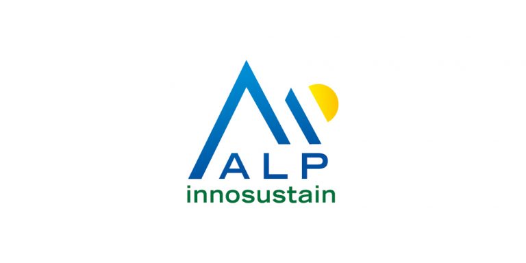
And when symbol and name share one construction — a lockup where the relationship is designed rather than defaulted — the pair reads as a single object, which is what lets the brand shrink gracefully:

How to tell a system from a single logo
Whether you're commissioning a brand or auditing your own, the test is short. Ask to see:
- The dark version. If it doesn't exist, dark mode and video end-cards are already improvising.
- The 32-pixel test. Shrink the mark to a favicon. Still legible? A system has a designed answer; a single logo has a shrug.
- The name test. Cover the wordmark. Does the symbol still say anything? Now the reverse. A system lets either half carry the brand.
- The container test. Pour it into a circle, a square, a rounded app icon. A system has a version for each; a single logo gets cropped by the platform instead.
Four answers, and you know whether you own an asset or an image.
Start reading systems, not logos
The fastest way to think in systems is to study enough of them that the patterns surface on their own. That's most of why this gallery exists. Browse the minimalist logo design wall to see reduction done on purpose, or the animated logos collection to see how motion extends a system into time. If you're still deciding on the structure itself, the wordmark vs symbol breakdown covers the decision that shapes everything after it.
- Minimal logos — reduction as a discipline
- Tech logos — systems built for screens first
- 3D logos — depth and light as system components
- Wordmark vs Symbol — the structural choice, and what each one costs